The Hidden Meaning Behind the Wendy’s Logo: What People Are Just Now Noticing
A Closer Look at a Familiar Fast-Food Icon
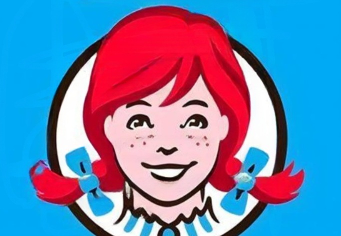
When people think of recognizable fast-food brands, few logos feel as warm and approachable as the one used by Wendy’s. At first glance, it appears simple: a smiling red-haired girl with freckles, styled in a classic, old-fashioned look, complete with neatly tied pigtails and a ruffled collar.
Unlike many modern logos that rely on bold graphics or flashy colors, this one leans into a sense of comfort and familiarity. It evokes something personal—almost like a home-cooked meal or a welcoming place where people gather. This softer approach to branding is part of what has helped the company stand out in a highly competitive industry.
But over time, people began to notice something unusual hidden within the design—something that completely changed how they viewed the logo.
For years, the Wendy’s logo remained largely unchanged, quietly doing its job as a recognizable brand symbol. Then, a small detail started gaining attention online.
Observers began focusing on the ruffled collar beneath the character’s chin. When examined closely, the folds and shading in the design seemed to form a subtle word: “MOM.”
At first, this discovery seemed like a coincidence. But once people saw it, it became difficult to ignore. The letters appeared to be naturally embedded within the lines of the illustration, almost as if they had been intentionally placed there.
This sparked widespread curiosity. What had once been a simple logo suddenly felt layered with meaning.
The idea that the logo might contain the word “MOM” quickly gained traction—and for good reason. The word itself carries powerful emotional associations. It represents care, comfort, trust, and family.
For a fast-food brand, these are incredibly valuable qualities to be connected with. Many consumers associate fast food with convenience rather than warmth. But the “MOM” interpretation flipped that perception, suggesting a deeper, more personal message behind the brand.
It made people feel like the company was offering something more than just food—it was offering a sense of familiarity and comfort.
Part of what made the theory so believable is the real-life story behind Wendy’s. The company was founded by Dave Thomas, who named it after his daughter, Melinda “Wendy” Thomas.
From the beginning, the brand emphasized values like quality, care, and a more personal touch compared to its competitors. The idea that the logo might include a subtle nod to family—or even motherhood—felt consistent with that identity.
As a result, many people didn’t see the “MOM” detail as random. Instead, they viewed it as a thoughtful design choice that reinforced the company’s message.
How Social Media Amplified the Discovery
Once the theory started circulating online, it quickly gained momentum. Social media users shared images of the logo, zoomed in on the collar, and highlighted the shapes that resembled letters.
Discussions spread across platforms, with people debating whether the hidden word was intentional or simply a coincidence. Some even traced the lines of the collar to make the letters more visible.
What started as a small observation turned into a viral conversation. It became one of those internet moments where people feel like they’ve uncovered a hidden detail that had been there all along.
The Company’s Official Response
As the theory gained popularity, Wendy’s eventually addressed it. According to the company, the “MOM” detail was not intentional. They explained that the design of the collar was simply part of the illustration and not meant to spell any word.
In many cases, this kind of clarification would end the discussion. But here, it had the opposite effect.
Instead of shutting down the theory, the response added another layer to the conversation. By the time the company spoke out, people had already formed emotional connections to the idea.
Even after the official statement, many people continued to embrace the “MOM” interpretation. Not because they rejected the explanation, but because the idea itself felt meaningful.
This highlights an important aspect of design and branding: once something is released to the public, it is no longer controlled solely by its creators. People interpret it through their own experiences, emotions, and perspectives.
In this case, the meaning people found in the logo mattered just as much—if not more—than the original intent.
The Power of Emotional Branding
What makes this story especially interesting is how it demonstrates the power of emotional connection in branding.
Companies spend years trying to build relationships with their audiences. They want customers to associate their products with positive feelings and values. But those connections don’t always come from carefully planned strategies.
Sometimes, they happen organically.
The Wendy’s logo is a perfect example. Whether intentional or not, the “MOM” interpretation created a deeper emotional link between the brand and its audience.
It gave people a reason to feel something when they looked at the logo—and that’s something every brand aims to achieve.
How Consumers Shape Brand Meaning
Another key takeaway from this story is the role consumers play in shaping brand identity. People are not just passive viewers—they actively interpret and redefine what they see.
In doing so, they create shared meanings that can exist alongside the official narrative.
The Wendy’s logo became more than just a corporate symbol. It became part of a cultural conversation, influenced by millions of individual perspectives.
This kind of interaction shows how modern branding is a two-way relationship. Companies create designs, but audiences give them life.
The Lasting Impact of the Hidden Detail
Today, the Wendy’s logo remains unchanged. The same smiling face and ruffled collar continue to represent the brand.
But the way people see it has evolved.
For some, it’s simply a familiar fast-food logo. For others, it carries a deeper meaning—one tied to comfort, family, and emotional connection.
Whether the “MOM” detail was intentional or not has become less important over time. What matters is the impact it had.
It made people pause, look closer, and engage with the brand in a new way.
Why This Story Still Matters
The story of the Wendy’s logo is about more than just a hidden detail. It reflects how easily people can find meaning in small things—and how those meanings can spread and grow.
It also highlights the gap between intention and perception. Designers may create something with one idea in mind, but audiences can interpret it in completely different ways.
Sometimes, those interpretations become just as powerful as the original concept.
Final Thoughts
In the end, the Wendy’s logo achieved something remarkable. It sparked curiosity, conversation, and emotional connection—all from a simple design element.
Whether or not the word “MOM” was intentionally placed in the collar, it became real in the minds of millions of people.
And that’s what makes this story so compelling.
It shows that meaning doesn’t always come from what is created—it often comes from how it is seen.
And sometimes, the smallest details can leave the biggest impression.